In this article
Nobody tells you, when you’re researching a move, that a city’s transit map is almost useless. Maps show where things go. They don’t show how long it takes to get there, which is the only number that will actually restructure your life.
Jon Nouchi, Honolulu’s director of Transit, made this point at the Mpact conference in Toronto, and it’s worth sitting with. When he visits San Francisco, he notices that the map looks compact - not a big city, geographically - but the time doesn’t match the geography. The joke in both places is the same: “Honolulu is 30 minutes away from Honolulu.” Or an hour. The map lies by omission.
This is the thing to interrogate before you sign a lease anywhere.
What “On Time” Actually Means
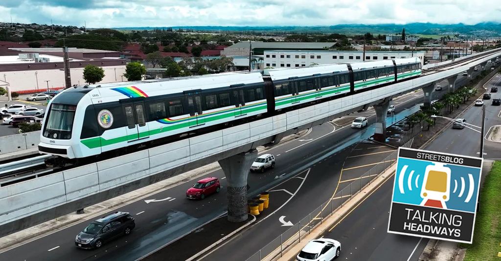
Honolulu’s Skyline rail line - the elevated heavy rail that opened in segments and is still expanding - operates within a 10-second window on either side of its scheduled arrival time to be considered on time. That’s a 20-second total window. Last month, according to Nouchi, the system hit 99.87% on-time performance.
For context: that figure almost certainly leads the country right now. Nouchi said as much directly. Whether it holds as the line extends is a real question, but for the moment, it’s a system that does what it says it will do.
That matters differently than it sounds. On-time performance in transit is usually a back-office metric - something agencies report to oversight boards. But Nouchi’s framing at the conference was sharper than that. He argued that reliability isn’t really about operations. It’s about time poverty. It’s about the caretaker who has four stops to make before she gets home. It’s about the parent calculating whether the bus will actually arrive before the after-school program closes.
Jeff Wood, the podcast host who interviewed Nouchi, raised a point from a book called Women Changing Cities by Chris and Melissa Bruntlett, which argues that time poverty - the deficit of hours created by inefficient caregiving logistics - is one of the most under-measured costs of how cities are built. The conversation touched on Bogotá’s experiment with “care blocks,” dense nodes where health services, childcare, and social services are co-located so residents don’t have to make five separate trips across a sprawling network. The idea: instead of extending transit to cover more ground, pull services closer to where people already are.
This is not how most American cities plan anything.
The Math a Relocator Should Actually Run
When Nouchi moved closer to his office - two blocks, seven-minute commute - his previous transit commute had been running roughly 20 minutes longer each way than driving. That gap is ordinary in most American cities. In some it’s worse.
Before you choose a neighborhood in any city you’re considering, run this calculation: What does the round-trip look like on the worst day, not the median day? Is the system grade-separated from traffic - like Skyline, which runs elevated and is therefore immune to road congestion - or does it sit in mixed traffic where a fender-bender on the interstate backs everything up?
In Honolulu, H-1 is one of the most congested stretches of highway in the country relative to the metro’s size. The joke about Honolulu being 30 minutes from itself is not really a joke. It’s a structural feature of an island where there are limited routes between the west side, where housing is cheaper, and Honolulu proper, where most jobs are. Skyline’s second segment opening - running from Aloha Stadium toward downtown - cut a commute from an hour and ten minutes to 27 minutes for at least one rider Nouchi spoke to directly during opening week. She found him the next day and, according to Nouchi, grabbed his face and told him she now gets two more hours with her kids every day.
That’s not a marketing line. That’s what grade-separated, reliable transit actually produces when it works.
What to Ask Before You Move Anywhere
The transit map tells you destinations. The performance data tells you whether the system is real. But neither tells you the thing that Nouchi was really gesturing at, which is whether the city is designed around the assumption that your time is worth something.
Some cities are not. They’re designed around the assumption that you own a car, that you have flexibility, and that the 45-minute commute is just the price of admission. In those cities, the transit map exists mostly for the people who have no other option.
A city that publishes station-to-station travel times - not just routes - is making a different promise. It’s saying the system is predictable enough to plan around. Nouchi mentioned this as something Honolulu is actively working toward for Skyline: listing the time between stations, not just the stops, because the travel time doesn’t vary. When your train runs within 20 seconds of schedule 99.87% of the time, you can print that number on a sign and mean it.
Most cities cannot print that number on a sign.
Before you relocate, ask which category your target city falls into - and then ask whether the neighborhood you’re considering actually connects to that system, or just appears to on the map.
The map, again, is almost useless.